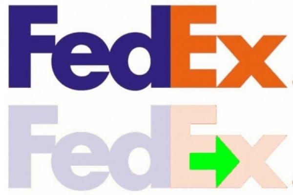
#7 FedEx
See the arrow? Bet you didn't know about it till now.
The arrow is kinda like a statement, getting things delivered from you to others with speed in precision.
Such a little thing, so much meaning.
The logo's pretty famous too and was won many awards, 40 design awards to be precise.
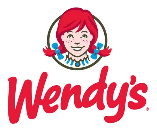
#6 Wendy's
You see the mom in the Wendy's girl's collar? That's Wendy's bragging about their home cooked taste.
Well played don't you think?
Sorry to kill the buzz...this design's meaning was unintentional. The people at Wendy's were just as dumbfounded when they were made aware of the meaning being implied.
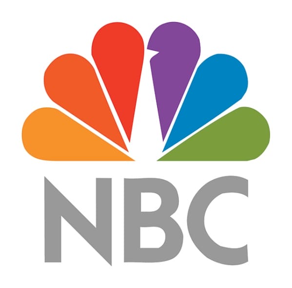
#5 NBC
People call it the "Peacock Network" for a reason you know. See the bird's head in their logo?
That was not an accident!
NBC has used a number of logos over the years but the Peacock one is their ultimate game. It was also used to highlight the network's color programming.
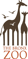
#4 The Bronx Zoo
See the space between the animals's legs? Look closely! They represent the buildings in Bronx!
This is called a 'negative space gem' of logo designs. The bird's pay and animals pay homage to the animals it house, while the negative space is aptly used to tip it's hat to its home city.
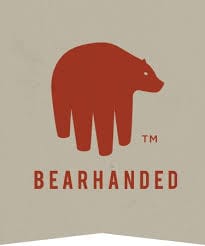
#3 Bearhanded!
Cmon this one's easy!
Don't tell me you can't see the bear/hand?!
Bearhanded teaches hoe to do stocks in the stock market. The bear and the hand makes certain that a quick play on words and images go a long way!
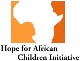
#2 Hope For African Child Initiative
See Africa?
Now, let's see if you can see the child.
This is one of those famous double image logos. At first you see the shape of Africa. On close observation you can see child listening to an adult. You can also say that the child is 'looking up' with hope towards the adult.
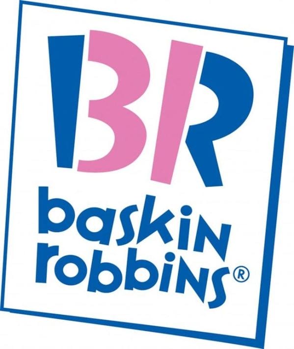
#1 Baskin Robbins
See how cleverly they sneaked in the number 31? 31 is also the number of flavors they offer.
The dual colored logo is the epitome of subtle hidden logo meanings. Quirky yet so completely logical in their meaning.
Clever and creative companies aren't they?